Difference between revisions of "Apertium logo"
m |
|||
| Line 77: | Line 77: | ||
[[Image:Babel-apertium-example.png|center]] |
[[Image:Babel-apertium-example.png|center]] |
||
--[[User:Aimaz|Aimaz]] 13:03, 25 August 2007 (BST) |
--[[User:Aimaz|Aimaz]] 13:03, 25 August 2007 (BST) |
||
===Mezcla=== |
|||
The one that sergio has second (with the red teeth), but instead of the teeth, the tower. |
|||
Revision as of 08:40, 26 November 2007
We are looking for a logo for Apertium. The one in the top-left corner is temporary.
Things to do with languages
Babelfish, Babel, Tongues, Trees (e.g. PSTs, Genetic-relationship trees, knowledge tree, etc.), [more here]
Suggestions
Please post comments and suggestions on these logos to the talk page!
Browse them on the Apertium website
Speak thru me
My logo suggestion. SVG is available, so scaling isn't a worry:
Elaboration
The logo represents two people facing each other - speaking through Apertium. The faded mirror reflection of "apertium" represents one language morphing into another. --Cabrilo 12:22, 16 August 2007 (BST)
Apertium's got balls
Another proposal of mine, with two font versions:
Elaboration
Same meaning and metaphor as the first one, the ball representing the "box" through which translation happens. --Cabrilo 12:29, 16 August 2007 (BST)
Corporativa generica
Elaboration
Doesn't really say anything, but the 'A' inside the circle is quite cool, and could be adapted for a more compact logo. The circle part could be done better, and I don't like the font much (was thinking of a more blocky / futurey one). - Francis Tyers 12:56, 16 August 2007 (BST)
Open window/door
- Apertium < Latin Apertum, open.
- the stylized sun has a stylized a/@, from apertium ;-)
Open box
Elaboration
Box, with different writing systems coming out, at the moment random, but they could spell out something, maybe Apertium? :) I think currently the box icon is non-free, but this could easily be replaced by someone with a modicum of artistic skill (that is, not me). The Apertium font could also be changed. - Francis Tyers 15:55, 19 August 2007 (BST)
Black & white
This is my preferred one. The blocks below can represent the translator structure, but it doesn't matter.
A variation with helvetica and an icon logo in the left.
A variation on the icon
--Sortiz 21:54, 19 August 2007 (BST)
Red stairs
This logo is what wikimedia does with a SVG.
This other is what I did with my computer.
--Sortiz 07:15, 24 August 2007 (BST)
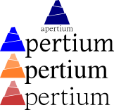
Tower of Babel
Stylised tower of babel.
Examples of other colours and fonts
--Aimaz 13:03, 25 August 2007 (BST)
Mezcla
The one that sergio has second (with the red teeth), but instead of the teeth, the tower.


