Difference between revisions of "Apertium logo"
OverPowered (talk | contribs) m (added link to svg file) |
|||
| (8 intermediate revisions by 3 users not shown) | |||
| Line 1: | Line 1: | ||
This is the Apertium logo: [[Image:Apertium open box logo 768.png|center|300px]] |
|||
[https://github.com/apertium/organisation/blob/master/images/apertium-logo.svg Link to SVG file] for the current logo |
|||
---- |
|||
{{deprecated}} |
|||
{{TOCD}} |
{{TOCD}} |
||
We are looking for a logo for Apertium. The one in the top-left corner is temporary. |
We are looking for a logo for Apertium. The one in the top-left corner is temporary. |
||
| Line 9: | Line 19: | ||
''Please post comments and suggestions on these logos to the [[Talk:Apertium logo|talk page]]!'' |
''Please post comments and suggestions on these logos to the [[Talk:Apertium logo|talk page]]!'' |
||
''Browse them on the [http://xixona.dlsi.ua.es/apertium-www/?id=logo&lang=en Apertium website]'' |
|||
=== Speak thru me === |
=== Speak thru me === |
||
| Line 41: | Line 53: | ||
===Open box=== |
===Open box=== |
||
[[Image:Apertium open box |
[[Image:Apertium open box logo 768.png|center|300px]] |
||
====Elaboration==== |
====Elaboration==== |
||
Box, with different writing systems coming out, at the moment random, but they could spell out something, maybe Apertium? :) I think currently the box icon is non-free, but this could easily be replaced by someone with a modicum of artistic skill (that is, not me). The ''Apertium'' font could also be changed. - [[User:Francis Tyers|Francis Tyers]] 15:55, 19 August 2007 (BST) |
Box, with different writing systems coming out, at the moment random, but they could spell out something, maybe Apertium? :) I think currently the box icon is non-free, but this could easily be replaced by someone with a modicum of artistic skill (that is, not me). The ''Apertium'' font could also be changed. - [[User:Francis Tyers|Francis Tyers]] 15:55, 19 August 2007 (BST) |
||
:Box icon upgraded to a free version, courtesy of Andrej Slapnik (B-rat). - [[User:Francis Tyers|Francis Tyers]] 19:16, 15 March 2008 (UTC) |
|||
===Black & white=== |
===Black & white=== |
||
| Line 75: | Line 89: | ||
[[Image:Babel-apertium-example.png|center]] |
[[Image:Babel-apertium-example.png|center]] |
||
--[[User:Aimaz|Aimaz]] 13:03, 25 August 2007 (BST) |
--[[User:Aimaz|Aimaz]] 13:03, 25 August 2007 (BST) |
||
===Mezcla=== |
|||
The one that sergio has second (with the red teeth), but instead of the teeth, the tower. |
|||
Latest revision as of 08:18, 22 May 2021
This is the Apertium logo:
Link to SVG file for the current logo
This discussion page is deprecated as the functionality now exists.
We are looking for a logo for Apertium. The one in the top-left corner is temporary.
Things to do with languages[edit]
Babelfish, Babel, Tongues, Trees (e.g. PSTs, Genetic-relationship trees, knowledge tree, etc.), [more here]
Suggestions[edit]
Please post comments and suggestions on these logos to the talk page!
Browse them on the Apertium website
Speak thru me[edit]
My logo suggestion. SVG is available, so scaling isn't a worry:
Elaboration[edit]
The logo represents two people facing each other - speaking through Apertium. The faded mirror reflection of "apertium" represents one language morphing into another. --Cabrilo 12:22, 16 August 2007 (BST)
Apertium's got balls[edit]
Another proposal of mine, with two font versions:
Elaboration[edit]
Same meaning and metaphor as the first one, the ball representing the "box" through which translation happens. --Cabrilo 12:29, 16 August 2007 (BST)
Corporativa generica[edit]
Elaboration[edit]
Doesn't really say anything, but the 'A' inside the circle is quite cool, and could be adapted for a more compact logo. The circle part could be done better, and I don't like the font much (was thinking of a more blocky / futurey one). - Francis Tyers 12:56, 16 August 2007 (BST)
Open window/door[edit]
- Apertium < Latin Apertum, open.
- the stylized sun has a stylized a/@, from apertium ;-)
Open box[edit]
Elaboration[edit]
Box, with different writing systems coming out, at the moment random, but they could spell out something, maybe Apertium? :) I think currently the box icon is non-free, but this could easily be replaced by someone with a modicum of artistic skill (that is, not me). The Apertium font could also be changed. - Francis Tyers 15:55, 19 August 2007 (BST)
- Box icon upgraded to a free version, courtesy of Andrej Slapnik (B-rat). - Francis Tyers 19:16, 15 March 2008 (UTC)
Black & white[edit]
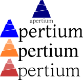
This is my preferred one. The blocks below can represent the translator structure, but it doesn't matter.
A variation with helvetica and an icon logo in the left.
A variation on the icon
--Sortiz 21:54, 19 August 2007 (BST)
Red stairs[edit]
This logo is what wikimedia does with a SVG.
This other is what I did with my computer.
--Sortiz 07:15, 24 August 2007 (BST)
Tower of Babel[edit]
Stylised tower of babel.
Examples of other colours and fonts
--Aimaz 13:03, 25 August 2007 (BST)
Mezcla[edit]
The one that sergio has second (with the red teeth), but instead of the teeth, the tower.


